Goodreads Redesign
For fun, I started redesigning Goodreads because it had one of the worst user experiences I knew – and I am a book nerd.
overview
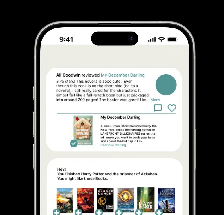
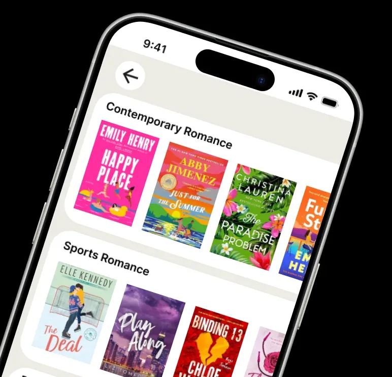
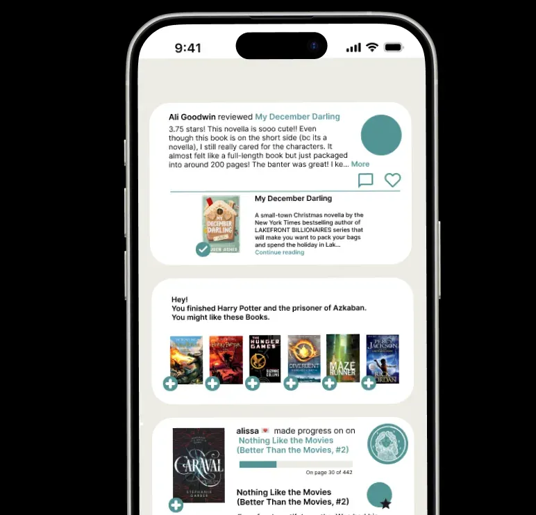
Goodreads has become an integral part of the online reading community (particularly on YouTube and TikTok), but its mobile experience suffers from outdated user interfaces. I tried to solve this issue to bridge the gap between the platform’s database and modern users’ need for an intuitive, socially oriented experience, so I could challenge myself and see if my idea could improve the user experience.
my journey
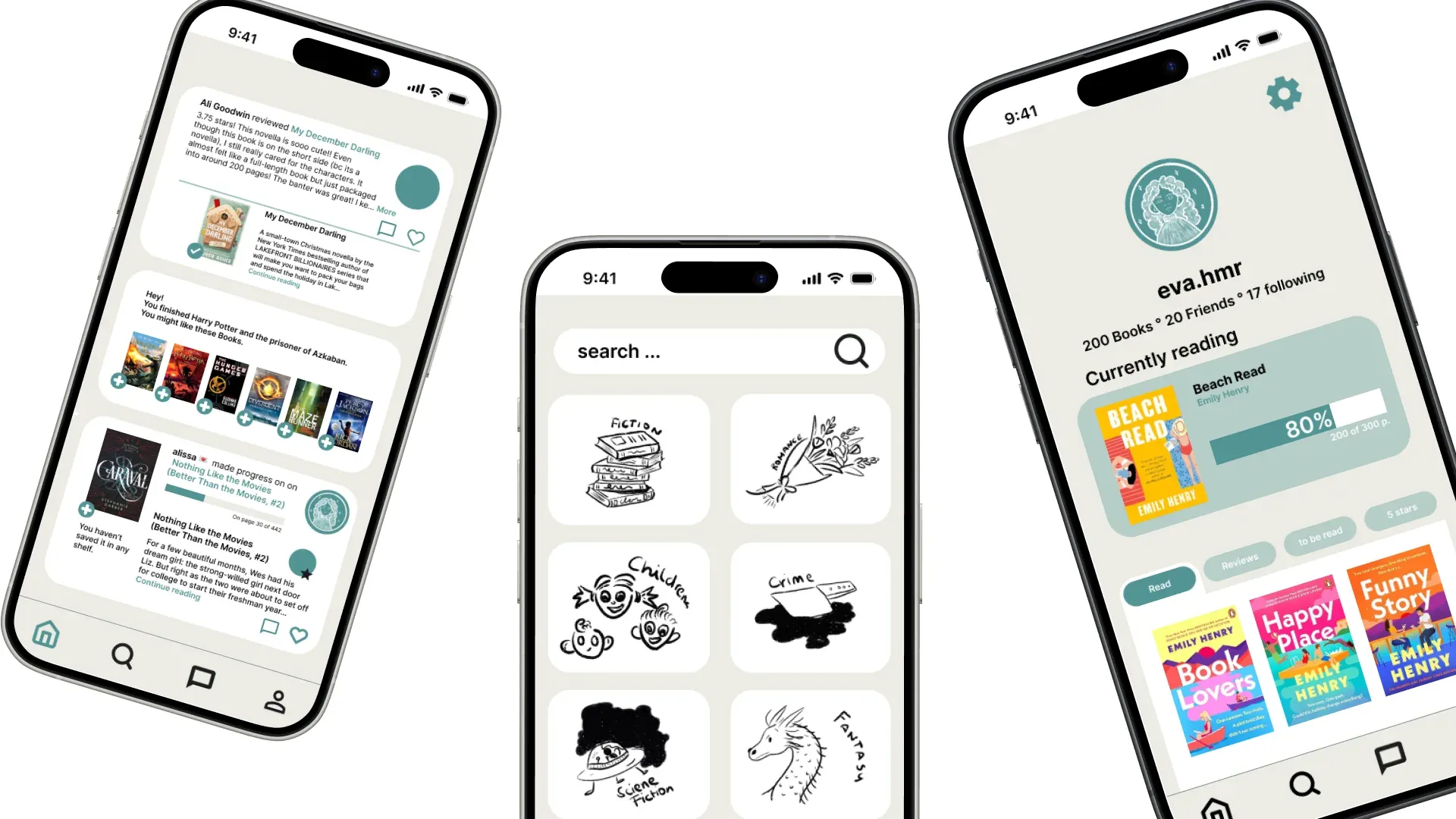
I decided to stay true to Goodreads’ visual identity, especially the newer look they have started rolling out on parts of their website, and carry it over to the app, bringing an interface that still feels like the 2000s up to a 2025 standard. To understand the problem beyond my own experience, I asked friends what they thought of the app. Some had no complaints, but others ran into the same issues I did: exhausting user journeys and an outdated interface that makes you want to leave the app immediately. I then started prototyping in Figma, with a focus on intuitive UX, so that users always know where to go to find what they are looking for. After finishing the design, I showed it to the same friends, who told me it felt much more intuitive.
learnings
This project taught me how much a design improves when it starts with real users instead of my own assumptions. By asking friends about their experience with the Goodreads app, I found out that frustrations like exhausting user journeys and an outdated interface were not just my own, which gave me a clear direction for the redesign. Prototyping in Figma with a focus on intuitive navigation showed me that good UX comes down to users knowing where to go without having to think about it. I also learned how to modernise an existing product while staying true to its visual identity, so the result feels like an evolution of Goodreads rather than a different app. In the end, my friends told me the new design felt much more intuitive, which confirmed that the changes solved the problems I had identified.